

Exploring Split-Complementary Colour Schemes in Watercolour
How to add harmony, contrast, and creative tension to your paintings with ease

Dear Creative Soul,
One of the most powerful yet underused colour strategies in watercolour painting is the split-complementary colour scheme. It offers the vibrancy of complementary colours without the harsh tension that can sometimes come from directly opposing hues. Instead, it introduces a subtle triadic harmony that brings both balance and dynamic energy to your artwork.
Today, let’s dive into what makes split-complementary colour schemes so compelling and how you can begin using them in your own watercolour practice.
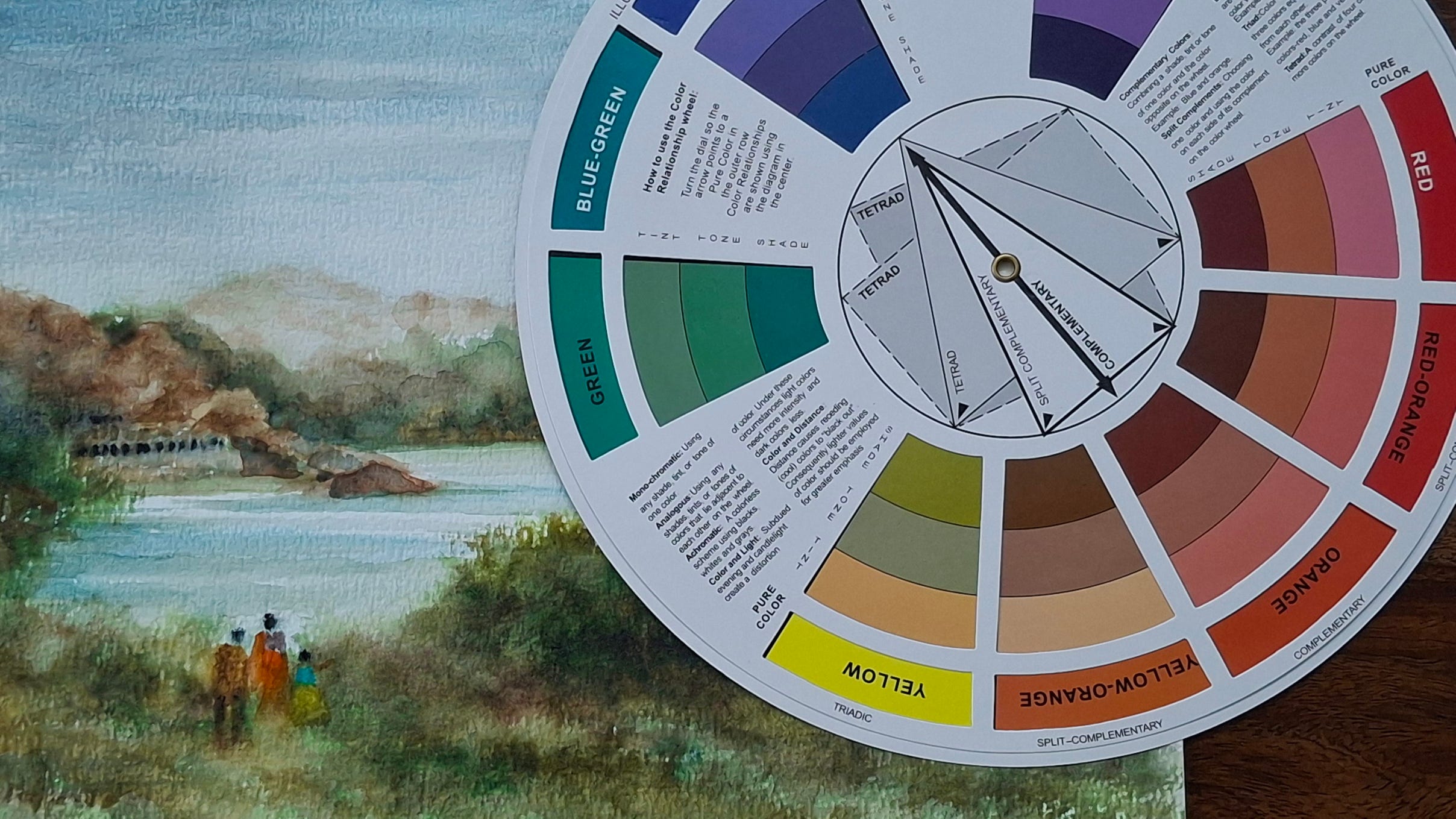
🎯 What Is a Split-Complementary Colour Scheme?
At its core, a split-complementary scheme involves:
One base colour, and
Two colours adjacent to its direct complement on the colour wheel.
For example:
If your base colour is blue, its complement is orange.
The split-complementary colours would be yellow-orange and red-orange.
This gives you a three-colour palette that is more flexible than direct complements and easier to harmonize.
💡 Why Use It in Watercolour?
Watercolour as a medium thrives on transparency, light, and subtlety. The split-complementary colour scheme gives you:
Vibrancy with control – You get contrast and energy without overwhelming clashes.
Balance and harmony – The triadic nature of the palette creates visual equilibrium.
Creative freedom – It allows expressive colour use while maintaining cohesion.
🌿 How to Apply This Scheme in Your Painting
Here’s a simple step-by-step:
Pick your base colour – Choose the dominant hue for your subject or mood.
Find its complement, then pick the two colours adjacent to that.
Use the base colour for most of the painting (60%).
Add the split-complements as accents (30% + 10%) to highlight edges, contrast areas, or focal points.
Keep your washes light and layered—let the colours dance and mingle.
🎨 Real-World Application Examples
A sunset scene could use violet as the base, with yellow-orange and yellow-green as accents.
A vintage heritage doorway might use red-orange as the base, with blue and blue-green split complements for the shadows and background.
This approach works beautifully in architectural scenes, nature studies, still-life compositions, and even abstract works.
🧪 Pro Tip from My Studio
Before jumping into your final painting:
Create a mini swatch card or colour mixing strip using your chosen split-complementary trio.
Experiment with layering, transparency, and value contrast.
See how the colours behave when diluted, mixed, and glazed.
This little test will give you great confidence and direction.
✍️ Final Thoughts
In the world of colour, the split-complementary palette is like the golden mean—a perfect balance between vibrancy and subtlety. It provides enough drama to excite the viewer and enough harmony to keep them engaged. For a watercolour artist, it’s a smart and soulful way to elevate your colour choices.
Why not try a split-complementary challenge today? Choose one trio and paint a small study—feel the elegance of this colour harmony unfold beneath your brush.
💌 CTA – Join the Movement of Colourful Explorers
I’d love to see your interpretations using split-complementary colour schemes!
📌 Share your work and tag me on Instagram
📌 Subscribe if you haven’t already for weekly colour lessons and insider watercolour tips
📌 Ready to take your watercolour skills to mastery? Join the Watercolour Mastery Academy and explore structured lessons from basics to brilliance.
Until next time, keep flowing with colour and courage.
Warm wishes,
Chidanand
Watercolour Mastery Coach | Artist | Mentor
Your posts are simple yet insightful. Enjoy reading them :)
🥰 thank you. This topic is really interesting for me.