


Interpreting Images for Watercolor Paintings: The Art of Creative Expression
"Beyond Realism: How to Transform Photos and Locations into Expressive Watercolor Art"

Introduction: Why Interpretation Matters in Watercolor Painting
Watercolor painting is not about replicating an image pixel by pixel—it’s about expressing emotion, mood, and artistic vision. While photographs and real-life locations serve as excellent references, they should not limit an artist’s creativity.
Many beginner watercolorists make the mistake of trying to copy every detail exactly as seen. However, professional artists understand that art is about interpretation, not duplication. Your creativity, artistic choices, and emotions should shape your painting.
In this blog, we’ll explore how to interpret images effectively to create expressive watercolor paintings. By learning how to simplify, edit, and enhance your reference material, you’ll develop a unique artistic voice that goes beyond mere imitation.
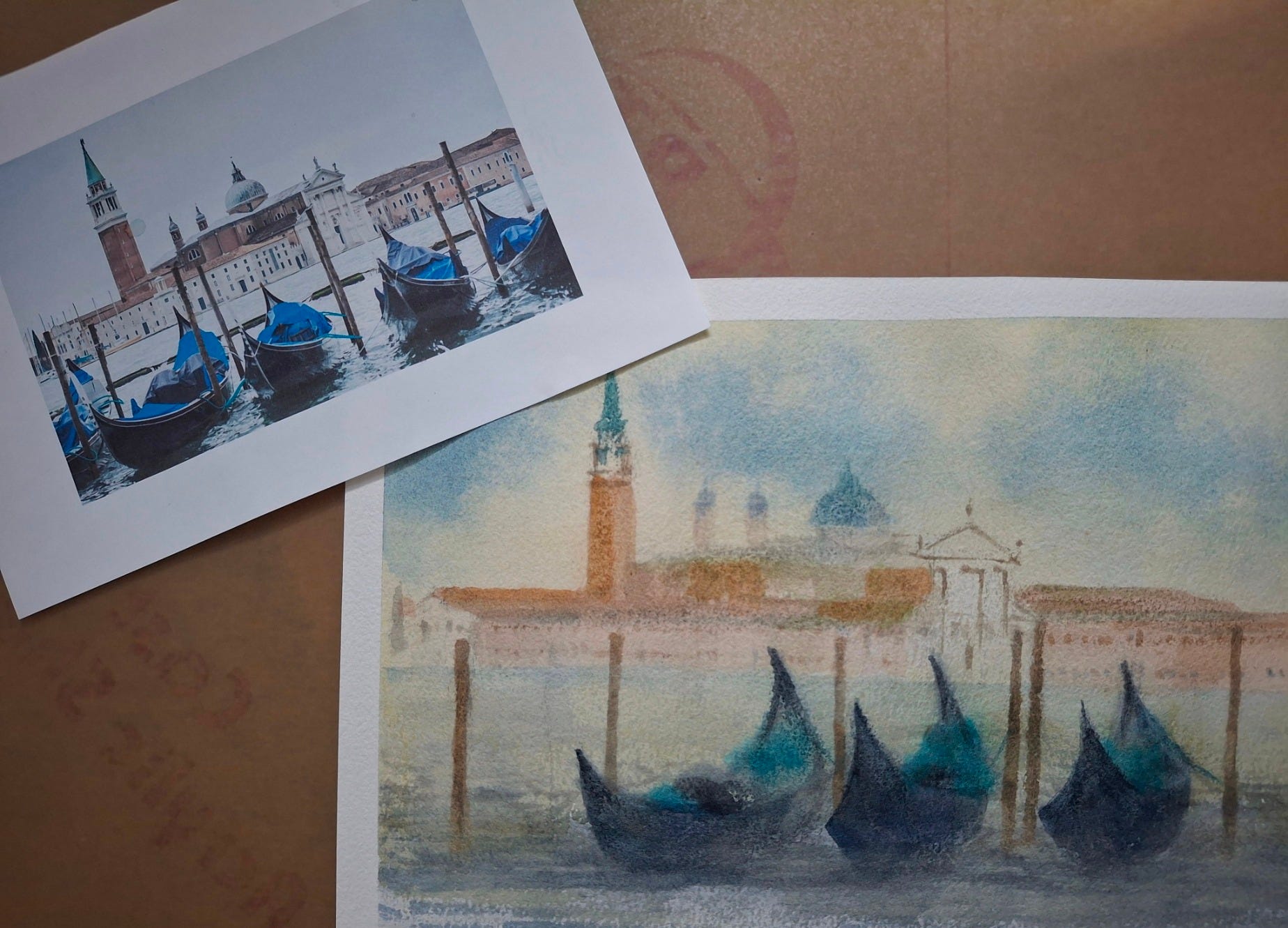
1. Don’t Copy Every Detail – Focus on the Essence
A photograph captures everything, but a painting should capture only what’s necessary.
✅ What to Keep & What to Eliminate:
Identify the main subject – What is the focal point of the image?
Remove distractions – Extra elements like unwanted buildings, people, or objects that clutter the composition should be left out.
Simplify backgrounds – A busy background can overpower the main subject. Watercolors work best when you allow for soft, flowing transitions and negative space.
💡 Tip: Ask yourself, “What is the story I want to tell?” Remove anything that doesn’t serve that story.
2. Eliminate Unnecessary Objects for a Stronger Composition
A great watercolor painting is not a photographic reproduction but a carefully curated scene where every element has a purpose.
✅ How to Decide What to Keep:
✔ Does this object add value? If not, remove it.
✔ Does it help guide the viewer’s eye? If it creates distraction, simplify it.
✔ Does it strengthen the composition? If not, consider altering it or adjusting its placement.
💡 Tip: Use thumbnails or quick sketches before painting to experiment with different compositions and see what works best.
3. Color Interpretation: You Are the Creator
One of the biggest artistic freedoms you have in watercolor painting is color selection. Just because a reference image has a blue sky and green trees doesn’t mean you have to use those colors.
✅ How to Make Creative Color Choices:
✔ Enhance emotions: Warm colors (reds, oranges, yellows) create energy and warmth, while cool colors (blues, purples, greens) create calmness and depth.
✔ Use complementary colors: Adding opposites (e.g., orange with blue, purple with yellow) makes paintings pop with vibrancy.
✔ Experiment with monochrome palettes: Try limiting your painting to shades of one or two colors for a unique effect.
💡 Tip: Don’t be afraid to break away from the reference image and add your own artistic personality through color!
4. Adjusting Lighting and Shadows for Mood & Depth
A photograph captures a fixed moment, but as an artist, you can manipulate light and shadow to create depth, contrast, and atmosphere.
✅ Ways to Enhance Light & Shadows in Watercolor:
✔ Soften or intensify shadows – Shadows create mood and depth.
✔ Alter the light source – You can create a sunset glow, dramatic lighting, or even foggy atmospheres.
✔ Use value contrasts – Bright highlights and deep shadows make paintings more dynamic and three-dimensional.
💡 Tip: Try adjusting the light by adding soft glazes of warm or cool tones to influence the overall mood of your painting.
5. Personal Interpretation: Make the Painting Your Own
What makes a painting unique is your interpretation of the subject. Two artists can paint the same reference, but each will have a completely different outcome based on their choices.
✅ Ways to Add Personal Style to Your Watercolor Painting:
✔ Exaggerate certain elements – If you love the curves of a tree, enhance them for a more dynamic effect.
✔ Stylize shapes and details – You don’t have to paint every window in a building or every petal in a flower. Simplify and stylize!
✔ Experiment with abstraction – Let the flow of watercolors guide your shapes and strokes, rather than strictly following a reference.
💡 Tip: Your goal isn’t to copy the reference—it’s to interpret it in a way that feels natural to you.
6. The Power of Negative Space in Watercolor
Watercolor is a medium that breathes best when it’s given space to flow. Many artists overwork their paintings by trying to fill every corner with detail.
✅ How to Use Negative Space Effectively:
✔ Let areas of the white paper show through for a more delicate and airy effect.
✔ Use soft, blurred edges to suggest shapes rather than outlining everything.
✔ Create focus by leaving out unnecessary details in background areas.
💡 Tip: Mastering negative space will give your paintings a loose, expressive quality that watercolor is known for.
Final Thoughts: Embrace Creative Freedom in Watercolors
Great watercolor paintings are not literal translations of reality—they are artistic expressions shaped by mood, emotion, and style.
By learning to interpret images creatively, you can:
✔ Simplify details for a stronger composition
✔ Eliminate distractions and unnecessary elements
✔ Use color freely to enhance mood and harmony
✔ Manipulate light and shadow for depth
✔ Develop your own signature artistic style
🎨 Remember: The best watercolor paintings are not perfect copies but inspired interpretations!
🎨 Call to Action: Join My Watercolor Mastery Community! 🎨
Do you want to learn how to create expressive and stunning watercolor paintings?
Join my Watercolor Mastery Community, where I teach:
✅ How to interpret reference images artistically
✅ Techniques for color harmony, light manipulation, and composition
✅ Step-by-step watercolor painting lessons for all skill levels
📩 Subscribe to my blog today for expert tutorials, professional insights, and exclusive lessons!
✨ Let’s paint with freedom, creativity, and imagination! 🎨🚀
As always, you always provide clear lessons in your articles. Thank you.