

Layering with Transparency for Delicate Watercolour Effects
How thin, transparent washes create luminous colour, depth, atmosphere, and refined detail

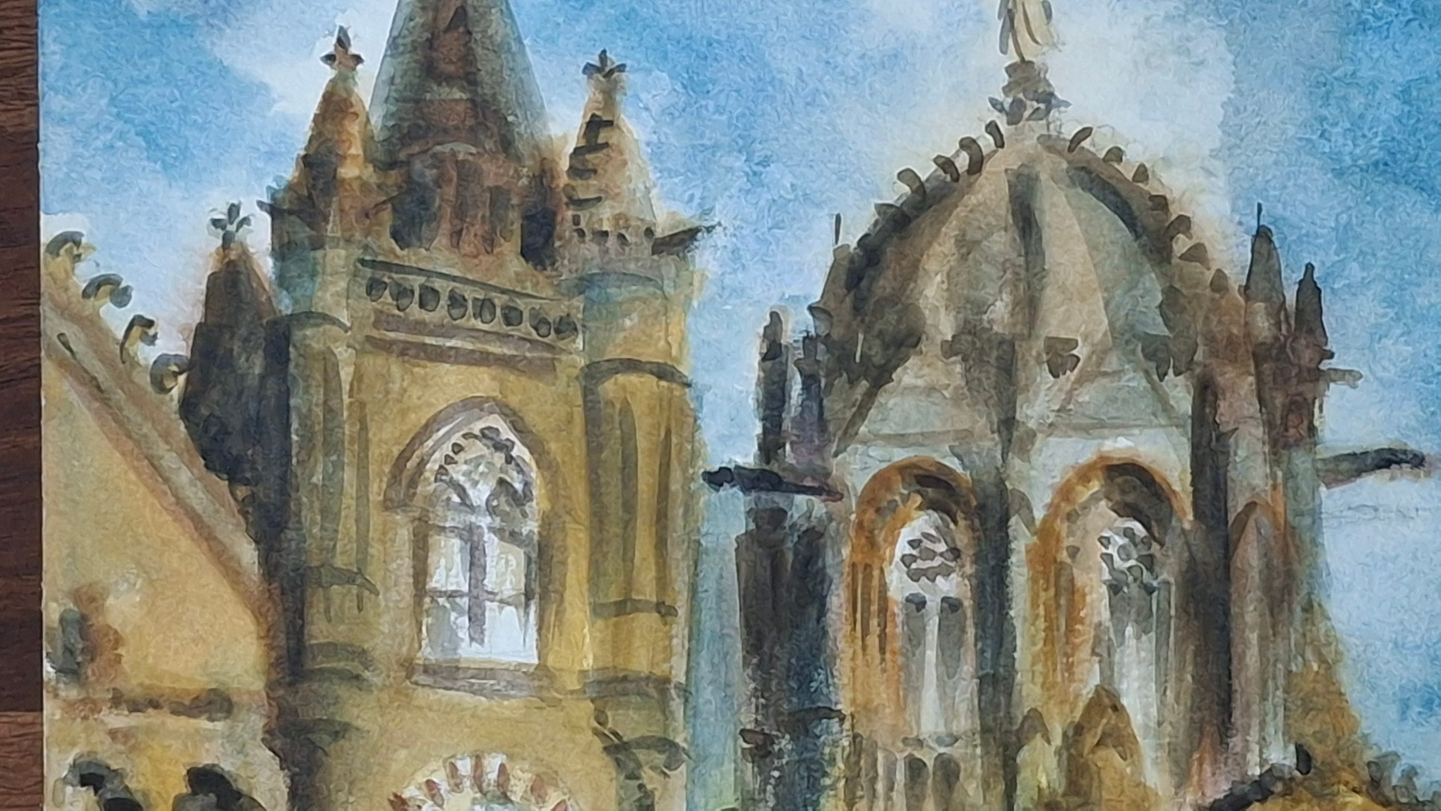
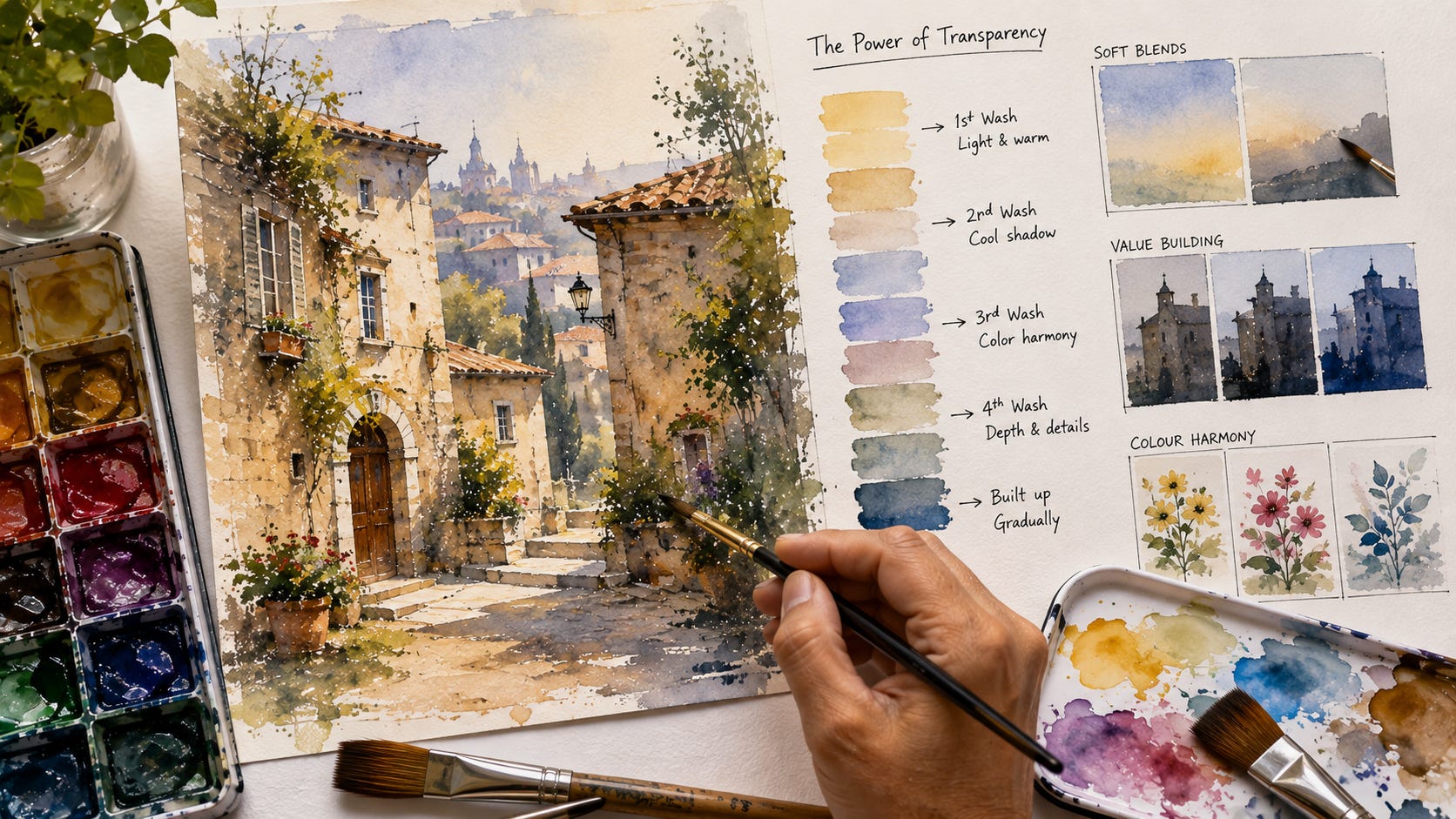
Transparency is one of the greatest qualities of watercolour.
The white paper reflects light through each transparent wash. This gives watercolour its freshness and glow.
A thick or muddy application blocks that light. A thin and carefully placed wash allows it to remain alive.
Watercolour artists can use this quality in many creative ways. They can build depth, change colour, strengthen shadows, soften forms, and create delicate effects without making the painting feel heavy.
One of the finest ways to use transparency is through layering, often called glazing.
What is layering in watercolour? 🎨
Layering means applying one thin wash over another dry wash.
The first layer remains visible through the next layer. The colours interact without fully covering each other.
For example, you can paint a light yellow wash and allow it to dry. Then you can place a transparent blue wash over part of it.
The layered area will appear green.
This green often feels clearer and more luminous than a green mixed heavily on the palette.
The paper, the first colour, and the second colour all take part in the final appearance.
Why transparency makes watercolour unique ✨
In many painting media, artists build light by adding lighter or opaque paint.
Traditional transparent watercolour often works in the opposite direction.
The light comes from the paper.
The artist protects that light and places transparent colour over it. Each wash acts like a thin sheet of coloured glass.
This allows the painting to gain richness without losing freshness.
A good transparent passage can appear delicate, deep, and full of light at the same time.
Layering builds values gradually
Value means how light or dark a colour appears.
A single pale wash creates a light value. A second wash deepens it. Further layers can create middle values and dark accents.
This gradual method gives the artist better control.
Instead of painting a dark passage at once, you can build it through several thin applications.
This is useful for:
shadows on buildings
folds in clothing
facial forms
trees and foliage
distant hills
reflections in water
flowers and botanical subjects
Each layer adds strength. The earlier washes still remain visible underneath.
Let every layer dry fully ⏳
This is one of the most important rules.
A fresh layer should go over a completely dry surface.
If the first wash remains damp, the next colour will spread into it. The result becomes a blend rather than a clear glaze.
Blending has its own beauty, but it is different from layering.
Test the surface with the back of your hand. Paper that still feels cool often contains moisture. Give it more time.
Patience protects transparency.
Use a light touch 🖌️
A glaze should sit gently over the previous colour.
Use a soft brush with enough paint to cover the area in one calm movement. Avoid scrubbing or repeatedly brushing the same place.
Too much pressure can disturb the earlier layer. It can lift pigment and create uneven patches.
Load the brush, place the wash, and leave it to settle.
This simple discipline makes a large difference.
Keep the pigment mixture clean
Prepare enough colour before starting the glaze.
A small amount of mixture may run out halfway through the passage. A newly mixed batch can have a different value or temperature.
Use clean water and a clean mixing area. Dirty water can reduce the clarity of transparent washes.
Test the mixture on a spare strip of the same paper.
The wash often dries lighter than it appears when wet, so the test helps you judge its strength.
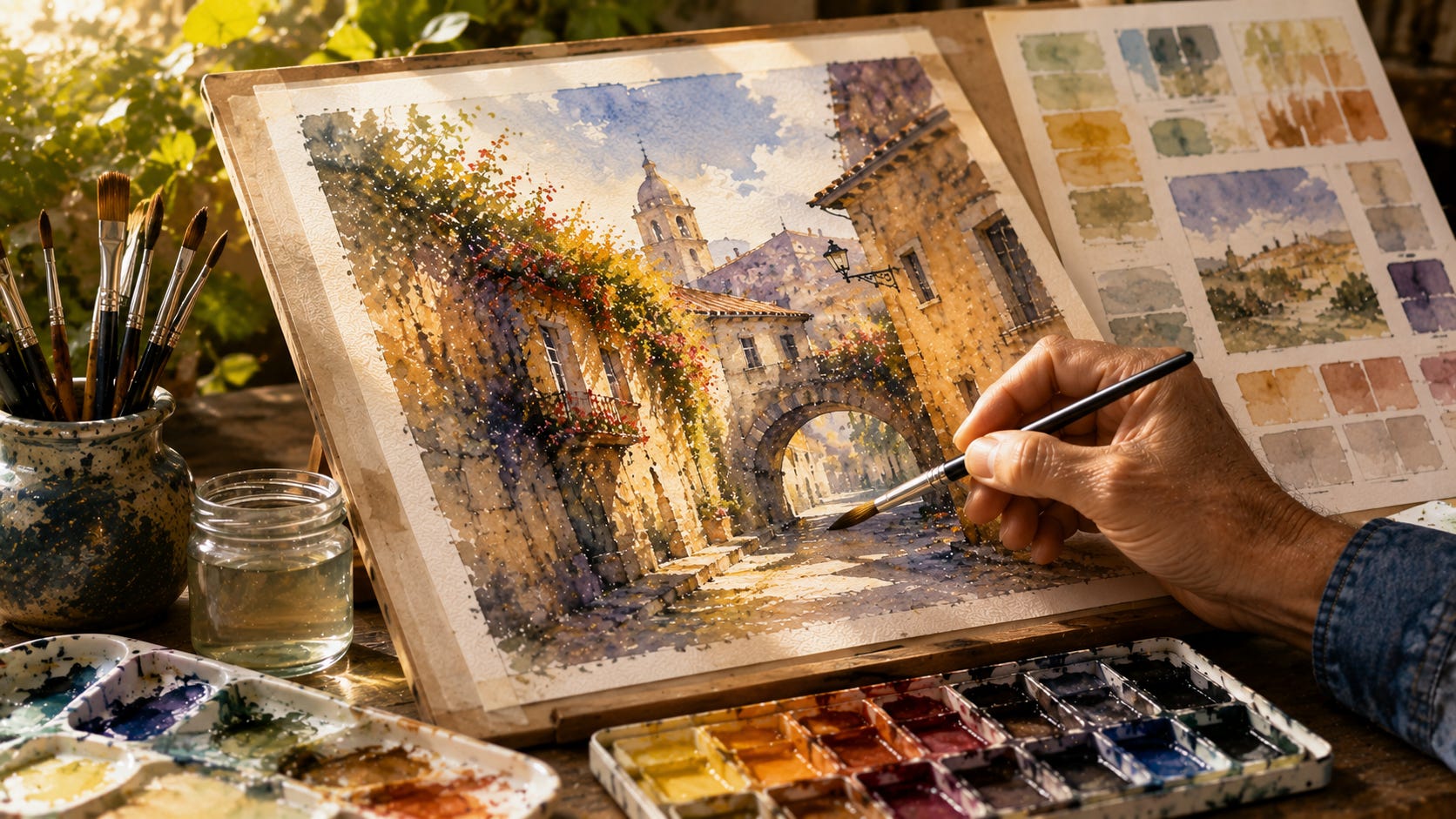
Transparent and opaque pigments behave differently
Not every watercolour pigment has the same level of transparency.
Transparent pigments allow more light to pass through the layers. They are often excellent for glazing.
Opaque and semi-opaque pigments can cover earlier washes more strongly. Thick applications of these colours can make repeated layers feel dense.
This does not make opaque pigments inferior. They serve different purposes.
Learn the character of each colour on your palette. Paint a simple chart showing each colour in a pale wash, a strong wash, and two or three layers.
That chart will become a valuable reference.
Different colours create new optical mixtures 🌈
Layering allows colours to interact directly on the paper.
Try these combinations:
Yellow under blue for clear greens
Rose under blue for violets
Blue under a warm earth colour for natural greys
Yellow under red for glowing oranges
Warm colour under a cool glaze for rich shadows
The order of the colours can change the result.
Blue over yellow may not look exactly like yellow over blue. Pigment strength, staining quality, granulation, and transparency affect the final colour.
Small experiments reveal these differences better than theory alone.
Layering in heritage architecture 🏛️
Heritage buildings are perfect subjects for transparent layering.
A first warm wash can suggest sunlight on stone or plaster. A second wash can describe shadow. A third can deepen arches, windows, roof spaces, and recessed areas.
Layering can help create:
weathered walls
carved stone
old doors and windows
tiled roofs
pillars and arches
shadows beneath balconies
distance between architectural planes
Thin washes keep the structure luminous. Heavy dark paint can make heritage surfaces appear dull and flat.
The goal is not to cover the first wash. The goal is to let it continue working through every later layer.
Layering in portraits 👩🎨
Portrait painting needs patience and restraint.
A light first wash can establish the warmth of the skin. Later layers can describe cheeks, eye sockets, the side of the nose, the neck, and the shadows beneath the hair.
Several thin glazes create more natural skin than one heavy mixture.
You can place warm and cool colours over each other to suggest living skin. Small shifts in colour often matter more than excessive detail.
Preserve the light areas from the beginning.
Layering in landscapes 🌄
Transparent layers create distance and atmosphere.
Start with light, soft colours in the sky and distant areas. Build stronger values in the middle ground. Reserve the deepest layers for the foreground and focal point.
Use glazing to strengthen:
distant hills
groups of trees
cast shadows
reflections
paths and roads
foreground foliage
This gradual value change helps the painting gain depth.
Layering in flowers and botanical work 🌸
Flowers contain delicate changes in colour.
A pale first wash can establish the basic colour of a petal. Later glazes can describe folds, veins, shadows, and colour shifts near the centre.
Transparent layering helps petals remain soft and luminous.
Keep some areas untouched. These preserved paper whites create sparkle and freshness.
A flower can lose its delicacy if every area receives the same number of layers.
Layering can create colour harmony
A very thin glaze placed over several areas can bring unity to a painting.
For example, a pale warm wash can connect sunlit walls, roads, and parts of the foreground. A cool glaze can link selected shadow areas.
Do not cover the whole painting without a clear reason.
Use the glaze only where it supports light, mood, and composition.
Avoid too many layers
Layering is powerful, but repeated glazing has limits.
Too many layers can:
reduce freshness
disturb the paper surface
make colours dull
create muddy mixtures
weaken the contrast between light and dark
Plan the values before you begin.
Ask what each new layer must achieve. Do not add a glaze only to keep working.
Knowing when to stop is part of mastery.
Common problems and their causes ⚠️
The previous layer lifts
The paper may still be damp. The brush may contain too little liquid. You may have pressed or brushed the area too many times.
The glaze dries with streaks
The brush may be too small. The mixture may be insufficient. The wash may have been applied too slowly.
The colour becomes muddy
Too many pigments may be interacting. The earlier layer may not be dry. The mixing water may be dirty.
The painting looks heavy
The washes may be too strong. Too many layers may cover the paper’s light.
Hard edges appear where they are not wanted
The wash may have started drying before the area was completed. Prepare enough mixture and work with a suitable brush.
A simple practice exercise 🎯
Divide a sheet of good watercolour paper into several rectangles.
Paint a pale wash of yellow, red, and blue in separate areas. Let them dry fully.
Then place different transparent colours over them.
Try:
blue over yellow
yellow over blue
red over blue
blue over red
burnt sienna over ultramarine
ultramarine over burnt sienna
Let every layer dry. Compare the results.
Next, paint one colour in one layer, two layers, three layers, and four layers. Observe how the value changes.
This exercise teaches more than memorising colour recipes.
A useful working method
Before painting, decide:
Where are the lightest areas?
Which shapes need one wash?
Which areas need two or three layers?
Where will the darkest accents appear?
Which pigments will remain clear through glazing?
Then work from light to dark.
Allow every layer to dry.
Use fewer strokes.
Stop once the values and forms feel complete.
The beauty lies in what remains visible
Transparent layering does not hide the past.
Every earlier wash continues to influence the painting.
That is the beauty of the process.
A warm layer can glow beneath a cool shadow. A pale colour can remain visible beneath a deeper value. A simple wash can slowly become a convincing wall, face, flower, tree, or distant mountain.
The painting grows through patience.
Layer by layer, the forms gain depth. Yet the light of the paper remains present.
That balance between colour and light gives transparent watercolour its delicate and lasting beauty.
Join My Watercolours Community 🎨
Are you passionate about learning watercolours in a clear and structured way?
Subscribe to this newsletter for practical lessons on brushes, pigments, paper, colour, composition, heritage subjects, and watercolour techniques.
I also invite you to join my Watercolours WhatsApp Community. Members receive inspiration, learning updates, discussions, and guidance that helps them practise with confidence and consistency.
👉 Join the community here:
https://chat.whatsapp.com/JRdm0j8klmh8ie0pQ05JPR
Let us learn how to preserve light, build colour, and create beautiful watercolours one transparent layer at a time.
This is very helpful. I took a Watercolor class last summer, but the instructor never explained the difference between blending and glazing. I will definitely try the Exercise you suggested.