


Introduction: The Secret Behind Beautiful Watercolor Art
Have you ever looked at a watercolour painting and felt mesmerized by its vibrant, harmonious colours? While it may seem like magic, the secret often lies in the artist’s understanding of the colour wheel. This simple yet powerful tool isn’t just for beginners—it’s the foundation of colour mastery for artists at every level.
If you’re serious about creating stunning watercolour paintings, learning how to make the optimum use of the colour wheel will transform your work. In this blog, I’ll walk you through how to harness the full potential of the colour wheel to create balance, contrast, and emotional impact in your art.
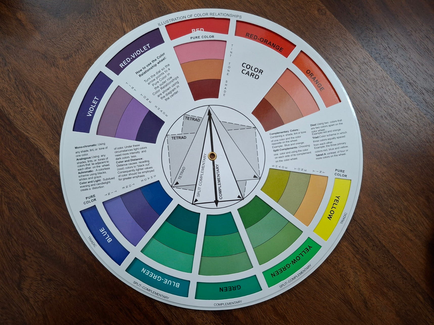
What Is the Colour Wheel?
The colour wheel is a circular chart that organizes colours based on their relationships. It’s a visual representation of how colours interact, allowing artists to understand which hues complement, contrast, or harmonize with each other.
Primary Colors: Red, Blue, Yellow
Secondary Colors: Green, Orange, Purple (created by mixing primary colours)
Tertiary Colors: Red-Orange, Yellow-Green, Blue-Violet, etc. (mixes of primary and secondary colours)
While it might look simple, the colour wheel holds the key to unlocking endless creative possibilities.
Why the Colour Wheel Is Essential for Watercolor Artists
In watercolour painting, colours behave differently compared to other mediums. The transparency and fluidity of watercolours mean that understanding colour relationships is crucial. Here’s why:
Achieving Color Harmony: The colour wheel helps you create palettes that feel balanced and pleasing to the eye.
Mixing Clean Colors: Avoid muddy mixes by understanding which colours blend well together.
Creating Mood and Atmosphere: Warm and cool colours can dramatically affect the mood of your painting.
Adding Depth and Contrast: Use complementary colours to make focal points pop and add visual interest.
How to Make Optimum Use of the Colour Wheel in Watercolor Painting
🎨 1. Mastering Color Harmony
The colour wheel helps you choose harmonious colour combinations effortlessly. Here are some classic schemes:
Complementary Colors: Colors opposite each other on the wheel (e.g., red and green, blue and orange). They create a strong contrast, making each colour stand out.
Analogous Colors: Colors next to each other on the wheel (e.g., blue, blue-green, green). They create a soothing, cohesive feel—perfect for landscapes or peaceful compositions.
Triadic Colors: Three colours evenly spaced around the wheel (e.g., red, yellow, blue). This creates a vibrant, balanced palette with rich contrasts.
Tetradic Colors: A combination of four colours forming a rectangle on the wheel, offering diversity with balance.
💡 Pro Tip: In watercolours, using one dominant colour with supporting accent colours from the wheel helps maintain harmony without overwhelming the viewer.
🎨 2. Mixing Colors Like a Pro
Understanding how colours mix on the wheel prevents muddy, dull results.
Primary Mixes: Mixing two primary colours gives you vibrant secondary colours. For example:
Red + Yellow = Orange
Blue + Yellow = Green
Red + Blue = Purple
Neutralizing Colors: Mix complementary colours to create neutral tones or greys, perfect for shadows and background depth.
Red + Green = Neutral brownish tones
Blue + Orange = Muted greys
Yellow + Purple = Soft browns
💡 Watercolor Tip: Always mix on a palette first. Because watercolours are transparent, layering colours creates more depth than mixing them all at once.
🎨 3. Creating Mood with Warm and Cool Colors
Warm Colors (Red, Orange, Yellow): Create energy, warmth, and excitement. Perfect for sunsets, autumn leaves, or vibrant florals.
Cool Colors (Blue, Green, Purple): Evoke calmness, tranquillity, and serenity—great for oceans, skies, and peaceful landscapes.
Balancing warm and cool tones adds emotional depth to your artwork. For example, using a cool blue background with a warm orange subject makes the subject pop while maintaining harmony.
🎨 4. Enhancing Depth with Contrast
The colour wheel helps you create depth through contrast.
Value Contrast: Combine light and dark colors for dramatic effects. A pale yellow sky next to dark blue mountains creates depth.
Color Contrast: Use complementary colors for striking contrasts. Think of a bright red flower against lush green foliage.
In watercolours, layering complementary colours (while letting layers dry in between) adds rich textures and dynamic contrasts without muddying the artwork.
🎨 5. Crafting Focal Points
A strong focal point grabs attention. To create this:
Use a complementary colour to make an element stand out.
Increase the saturation of one colour against a muted background.
Place warm colours against a cool-toned environment to draw the viewer’s eye.
Example: In a landscape, a small red boat in a sea of cool blues instantly becomes the focal point.
Practical Exercises to Improve Your Color Skills
Create a Color Wheel from Scratch: Painting your own wheel helps you understand colour relationships firsthand.
Mixing Charts: Choose two colours and create a gradient mix. Observe how they interact as you add more of one colour.
Complementary Studies: Paint simple objects using only complementary colour pairs to see how they contrast and balance.
Monochromatic Painting: Use different values of a single colour to explore depth and mood.
Colour Swatch Library: Build a personal swatch book with your favourite mixes to reference in future paintings.
Final Thoughts: The Colour Wheel Is Your Artistic Compass
Mastering the colour wheel isn’t about rigid rules—it’s about gaining the freedom to express yourself confidently. Whether you’re creating serene landscapes, bold abstracts, or delicate florals, understanding colour relationships helps you make intentional choices that elevate your art.
With practice, the colour wheel will become second nature—a silent guide in every brushstroke, helping you create paintings that captivate and inspire.
Call to Action: Ready to Master Watercolor with Confidence?
If you’re excited to dive deeper into the world of watercolour and want to learn how to unlock the full potential of colour, I invite you to join my Watercolor Mastery Community.
Through my step-by-step course, you’ll:
🎨 Learn the nuances of the colour wheel and how to apply them effectively.
🎨 Develop strong foundations in colour mixing, composition, and technique.
🎨 Discover your unique artistic voice through guided projects and exercises.
Subscribe to my blog today to stay updated on new lessons, tips, and upcoming courses designed to help you create beautiful, harmonious watercolour art with passion and purpose.
Let’s embark on this colourful journey together—one brushstroke at a time! 🎨✨

Share this post