


The Power of Complementary Colours in Watercolour Art
Create Vibrancy, Balance, and Impact by Mastering the Opposites on the Colour Wheel

Introduction: Opposites That Attract and Amplify
One of the most magical principles in watercolour painting lies in the power of complementary colours—pairs of colours that sit directly opposite each other on the colour wheel. When used thoughtfully, these colour duos can add visual energy, vibrancy, and harmony to your compositions.
Complementary colours help us:
🎨 Create striking focal points
🎨 Build mood and emotional contrast
🎨 Achieve dynamic balance and visual interest
🎨 Mix beautiful neutrals, greys, and shadows
In this article, let’s explore how you can skillfully use complementary colours to supercharge your watercolour paintings—whether you're working on landscapes, florals, portraits, or abstracts.
1. What Are Complementary Colours?
Complementary colours are pairs of hues opposite each other on the colour wheel:
Colour Complementary Colour
Red Green
Blue Orange
Yellow Purple (Violet)
These colour combinations offer maximum contrast. When placed side by side, they make each other appear brighter and more vibrant. When mixed, they neutralise each other to create subtle greys or browns—perfect for shadows and earthy tones.
💡 Think of them as creative “push and pull” partners—amplifying each other or calming one another, depending on how you use them.
2. Why Complementary Colours Work So Well in Watercolour
Unlike opaque mediums, watercolour is transparent and delicate. The layering of transparent hues allows complementary colours to:
✅ Enhance luminosity
✅ Create shimmering edges where colours meet
✅ Offer optical mixing effects (the eye blends the colours)
✅ Help create natural-looking shadows and colour harmony
🎯 This technique gives your work vibrancy without overloading the palette with too many pigments.
3. Practical Ways to Use Complementary Colours
✅ For Contrast and Focus
Use complementary pairs to highlight your focal point. For instance:
A red flower stands out brilliantly against a green background
A yellow object pops when placed in front of purple shadows
Blue skies gain warmth and balance from hints of orange glow
✅ For Colour Mixing
Mixing complementary colours gives you:
Beautiful neutrals
Subtle greys and browns
Shadow tones with a hint of underlying hue
Example: Burnt sienna (a warm orange-brown) mixed with ultramarine blue creates a rich, natural shadow colour used frequently in landscapes.
✅ For Dynamic Backgrounds
Try glazing one colour over its complement to build soft movement and mood, especially in skies, backgrounds, or water reflections.
💡 Complementary colour glazes work best when applied in transparent layers, allowing each to shine through.
4. Examples of Complementary Pairs in Watercolour Practice
🎨 Red & Green
Florals, botanical illustrations
Use sap green with alizarin crimson or permanent rose for rich contrast
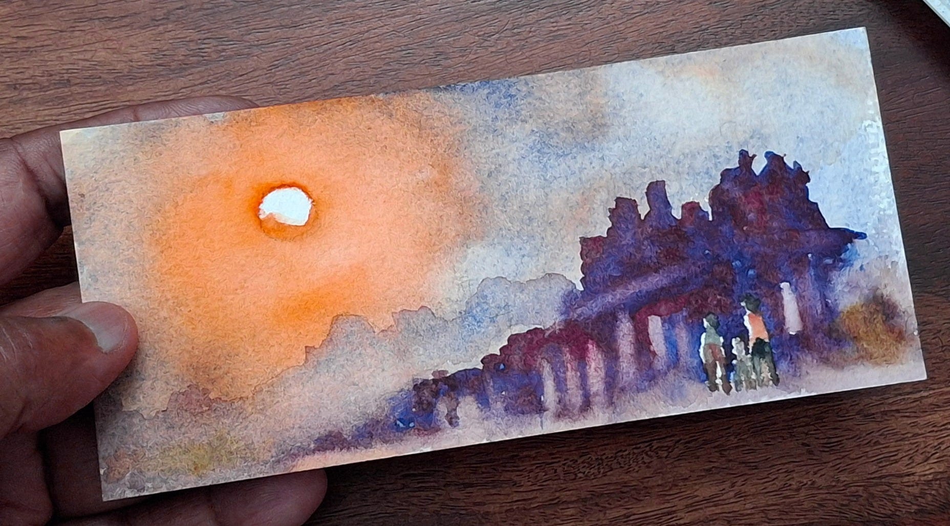
🎨 Blue & Orange
Skies, seascapes, sunlit buildings
Try cobalt blue with burnt sienna or cadmium orange
🎨 Yellow & Purple
Portraits, floral studies, sunset effects
Use lemon yellow with dioxazine violet for intensity
5. Tips for Using Complementary Colours Effectively
✅ Use one colour dominantly, and its complement as an accent
✅ Avoid mixing complements at full strength—they can turn muddy
✅ Let colours touch but not completely mix for vibrancy
✅ Use neutralised mixtures for shadows and backgrounds
✅ Try splitting the complement (use the colours on either side) for subtler harmony
💡 Complementary colours can be bold or soft—adjust with water, technique, and intention.
6. Common Mistakes to Avoid
🚫 Overusing both colours equally—can cause visual conflict
🚫 Mixing complements too strongly—results in dull mud
🚫 Using opaque pigments without planning for transparency
🚫 Forgetting about warm/cool variations within the pair (e.g., warm red vs. cool green)
🎯 The goal is balance and intentional contrast—not chaotic intensity.
7. Practice Ideas to Master Complementary Colours
🖌️ Create miniature colour studies using one complementary pair
🖌️ Paint a monochrome subject, then add small touches of its complement for impact
🖌️ Do a complementary underpainting, then glaze layers on top
🖌️ Paint the same scene twice—one in regular colours, one in complementary scheme
💡 Through practice, you'll gain confidence and intuitive understanding of colour interplay.
Final Thoughts: The Subtle Power of Opposites
Complementary colours are like artistic alchemy—they bring balance, intensity, and depth to your painting with just two hues. They help:
✔ Make compositions pop
✔ Add drama and dimension
✔ Mix more efficiently
✔ Create harmony with contrast
In watercolour, where light and layering are everything, complementary colours become the secret thread that connects emotion, technique, and storytelling.
🎨 Call to Action: Join My Watercolour Mastery Community!
Would you love to learn colour theory through hands-on watercolour lessons?
Join my Watercolour Mastery Community, where I guide you step-by-step to:
✅ Understand the power of colour relationships
✅ Mix clean and vibrant combinations
✅ Use complementary pairs for stunning compositions
✅ Grow your skills with support, structure, and inspiration
📩 Subscribe to my blog today to receive lessons, updates, and access to my upcoming training programs and resources.
✨ Let your brush speak the language of colour—and create magic through the contrast of complements. 🎨💫