Warm vs. Cool Colours: How Temperature Affects Your Painting
Harness the Emotional and Visual Power of Colour Temperature in Your Watercolour Art
Introduction: Colour Has a Temperature—and It Tells a Story
One of the most transformative insights an artist can gain is understanding colour temperature. Warm and cool colours aren’t just about red vs. blue—they carry emotional weight, direct the viewer’s eye, and influence the mood and depth of your watercolour painting.
Whether you're painting landscapes, florals, portraits, or abstracts, mastering warm and cool colours helps you:
🎨 Create atmosphere
🎨 Build contrast and harmony
🎨 Add a sense of depth
🎨 Convey emotion with subtlety
In this blog, we’ll explore the core concepts of warm vs. cool colours, how temperature shifts affect your composition, and how to skillfully integrate them into your watercolour work.
1. What Are Warm and Cool Colours?
Colour temperature refers to the visual “warmth” or “coolness” of a hue:
🔥 Warm Colours
Red, orange, yellow, burnt sienna
Evoke warmth, light, energy, closeness
Suggest sun, fire, heat, autumn, comfort
❄️ Cool Colours
Blue, green, violet, Payne’s grey
Evoke calm, distance, shadow, tranquility
Suggest water, sky, night, fog, melancholy
💡 Even within a single colour family (e.g., blue), some hues are warmer (ultramarine) and others cooler (phthalo blue).
2. How Temperature Influences Your Painting
✅ Creates Depth
Cool colours recede into the background
Warm colours come forward in the foreground
Use this principle to build realistic spatial layers
✅ Shapes Mood
Warm tones add energy and optimism
Cool tones suggest calm, mystery, or sadness
A warm-cool contrast adds emotional drama
✅ Adds Balance
Mixing warms and cools creates dynamic compositions
Use temperature to balance your palette and guide the eye
🎯 Want to direct attention to your focal point? Use warm tones where you want the viewer’s eye to rest.
3. How to Identify Warm and Cool Variants of Primary Colours
Each primary colour (red, yellow, blue) has warm and cool versions:
Primary Warm Variant Cool Variant
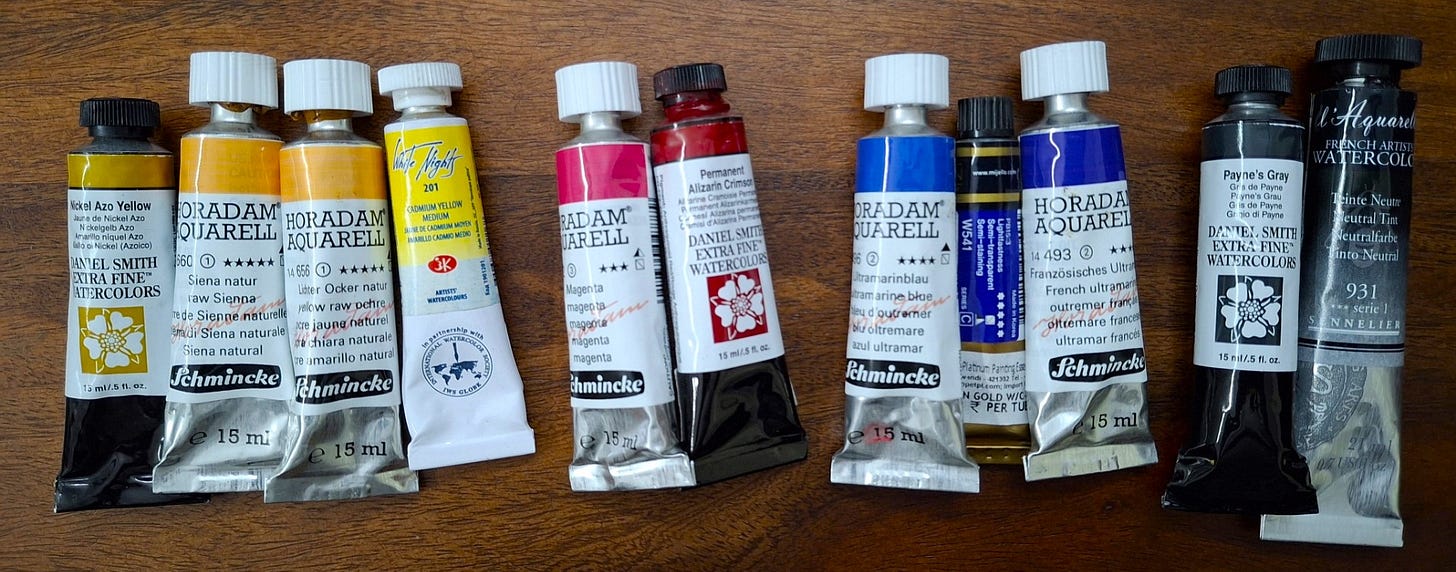
Red Cadmium Red, Vermilion Permanent Rose, Alizarin
Yellow New Gamboge, Indian Yellow Lemon Yellow, Bismuth Yellow
Blue Ultramarine Blue Phthalo Blue, Cobalt Turquoise
Green Sap Green Viridian
💡 Having both warm and cool versions in your palette improves colour mixing and temperature control.
4. Mixing Colours: Temperature Matters
✅ Warm + Warm = Vibrant, glowing colours
✅ Cool + Cool = Muted, atmospheric colours
✅ Warm + Cool = Neutralised, softer tones
Examples:
Warm red + warm yellow = Fiery orange
Cool blue + cool yellow = Mossy green
Cool red + warm green = Brownish neutral
🎯 Understanding temperature helps you mix clean, intentional colours instead of muddy surprises.
5. Using Temperature in Specific Subjects
🏞️ Landscapes
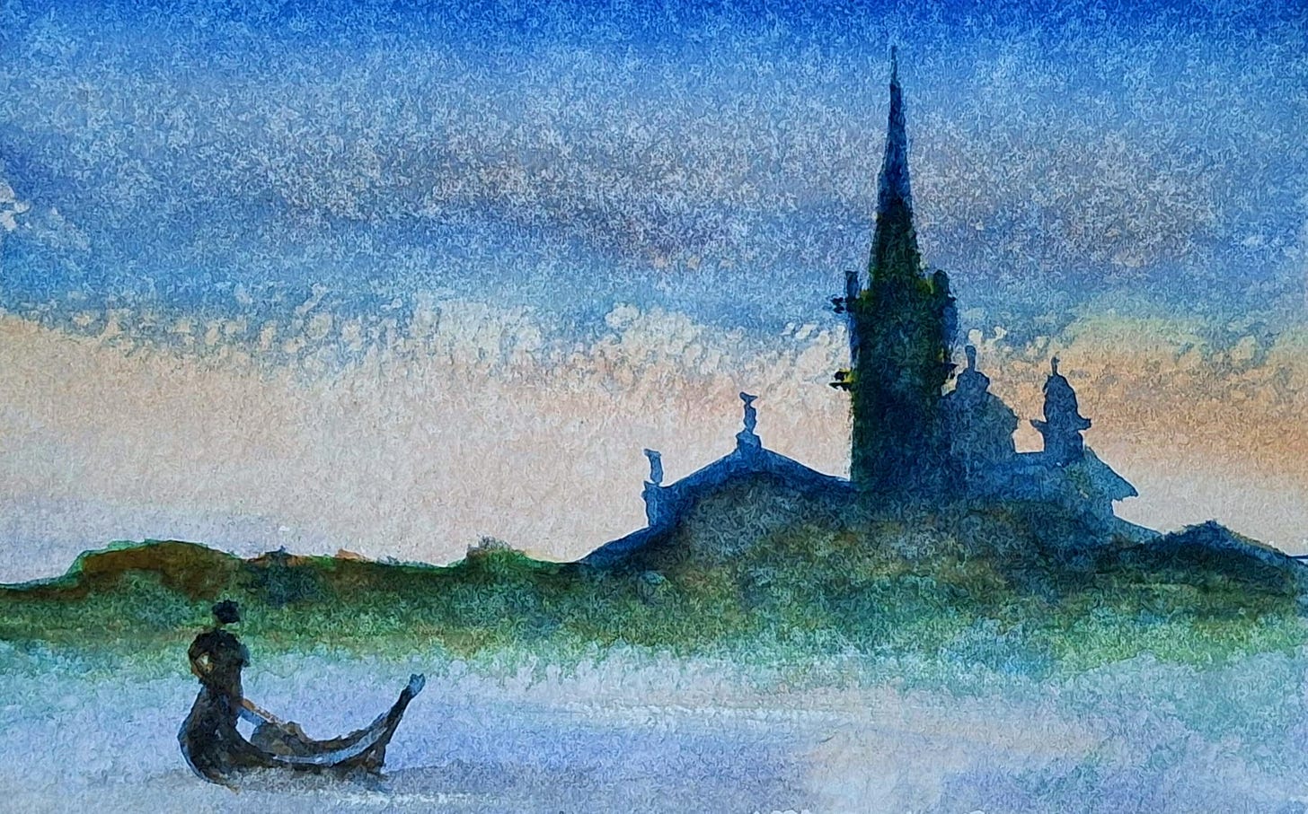
Use cool blues and greens in the distance
Warm tones like burnt sienna, ochre, and cadmium red for foregrounds
🌸 Florals
Warm pinks, reds, and yellows for sunlit petals
Use cool shadows to give contrast and volume
👩🎨 Portraits
Use cool greys and blues in shadows
Warm tones for skin highlights, lips, cheeks
🌌 Skies and Atmospheres
Mix cool colours for dawn/dusk
Layer warm washes for sunrise/sunset glow
6. Balancing Warm and Cool in Your Palette
A well-balanced palette often includes:
One warm and one cool version of each primary
A few earth tones (burnt sienna, yellow ochre)
A neutral or grey (Payne’s grey, neutral tint) for softening mixes
🎯 Avoid using only warm or cool colours—contrast adds life and energy.
7. Practice Exercises for Mastering Temperature
✅ Create a colour wheel with warm and cool variants
✅ Paint the same subject twice—once in warm tones, once in cool tones
✅ Try a split primary palette and explore mixing possibilities
✅ Paint a monochrome piece using a warm colour, then a cool one
Final Thoughts: Temperature Is a Silent Guide
Understanding warm vs. cool isn’t just technical—it’s emotional and intuitive. Once you begin tuning into it, you'll start making colour decisions that:
✔ Build stronger compositions
✔ Tell richer stories
✔ Evoke feelings with clarity and grace
✔ Improve your mixing and brushwork
In watercolour, temperature is the quiet language behind every glow, shadow, and subtle shift. Use it wisely, and your paintings will sing.
🎨 Call to Action: Join My Watercolour Mastery Community!
Want to master colour harmony, mixing, and storytelling through temperature?
Join my Watercolour Mastery Community, where I help you:
✅ Build palettes with warm and cool harmony
✅ Practice temperature in real-world scenes
✅ Learn value, mood, contrast, and design—all step-by-step
✅ Receive personalised feedback and grow within a vibrant artistic circle
📩 Subscribe to my blog today for tutorials, insights, and access to exclusive watercolour training programs.
✨ Let’s warm up your palette, cool down your shadows, and create with confidence—one brushstroke at a time. 🎨🔥❄️


